Garden Color Design How To Use Contrasts And Create Harmonies Effectively
Using color effectively in the garden, as in the kitchen or sitting room, is largely a matter of getting the right balance between harmony and contrast.
Contrast and harmony are desirable qualities in the garden because they establish a composition that has both unity and diversity. Shape size and form, like color, are responsible for the extent to which a composition works, but because the eye picks up color first, it is the most crucial factor in determining the character and quality of the garden.
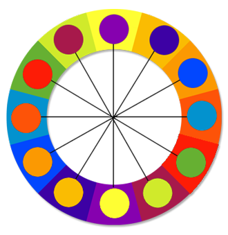
Harmonious colors like harmonious shapes are those that are similar but different to each other. Red with orange, blue with green, beige with brown, have enough in common to relax and calm the eye, yet by being different, stimulate it as well. The colors that form harmonious combinations are adjacent to each other on the prismatic color wheel.
Harmonious schemes are not necessarily quiet and restrained. A group of warm colors like red, orange, brown, and deep, reddish purple is likely to be fiery and stimulating. Excitement can also be induced without affecting the color harmony, by using lighter or darker versions of the same color, or by introducing silverleaved plants to the composition. In this respect, white, has a similar function to silver and grey.
It is a fact that color effects peoples mood. While the hot colors stimulate, the cold colors calm and relax. Mixing colors at random mixes the mood as well, creating discord and chaos, instead of contrast, which to work effectively, has to be balanced with harmony.
It follows therefore that contrasting colors have to be used very carefully and sparingly. Their purpose, as previously mentioned, is to lift up the garden where that is necessary. The strongest contrasts occur with the combination of the complementary colors, which are those that are opposite each other on the color wheel. In order to avoid clashes, the contrasting color can be of similar intensity to the harmonious colors with which it is contrasting. For instance, Red and green are complementary colors. If you are looking for a color to contrast with a cool green and blue group, a pink colored rose could provide the contrast, as opposed to a rose with Bordeaux or flaming, orange flowers, which are liable to clash with blues and greens.
The over-use of dramatic contrasts, while meant to create interest, ironically become monotonous and dull, once the initial excitement has passed. An example of this is the peppering of deep, purple-leaved plants throughout the garden. Have you ever listened to a piece of music that knocked you out on first listening, only to leave you with a flat feeling afterwards?


0 Response to "Garden Color Design How To Use Contrasts And Create Harmonies Effectively"
Post a Comment